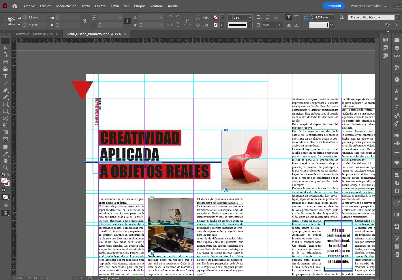
This selection brings together eight editorial design projects developed as part of my graphic design training. The course focused on the principles of editorial composition, typographic hierarchy and visual balance, combining creativity with a strong emphasis on readability and functionality.
The training took place in Madrid over a period of two months and was divided into two modules: Typography and Layout Design (150 hours) and Desktop Publishing (130 hours).
The projects were developed primarily using Adobe InDesign for editorial layout and composition and Adobe Photoshop for image editing and retouching. The course also covered the technical preparation of files for print, including print specifications, file setup, and the creation of production-ready final artwork.
This selection reflects my approach to editorial design as a balance between structure, readability, visual hierarchy and creativity.
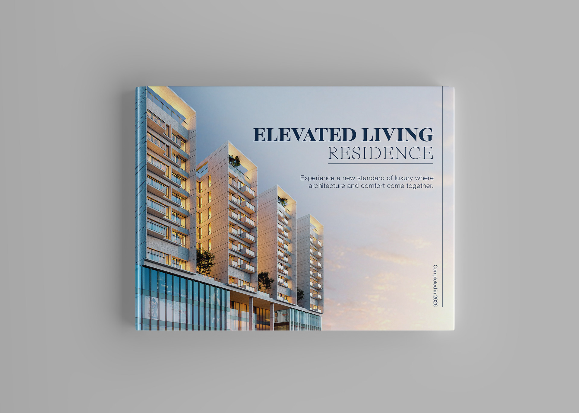
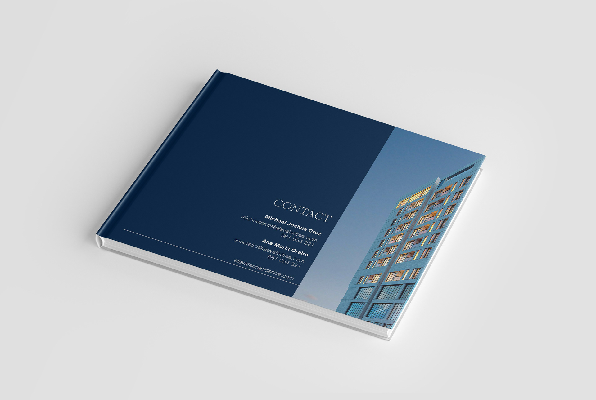
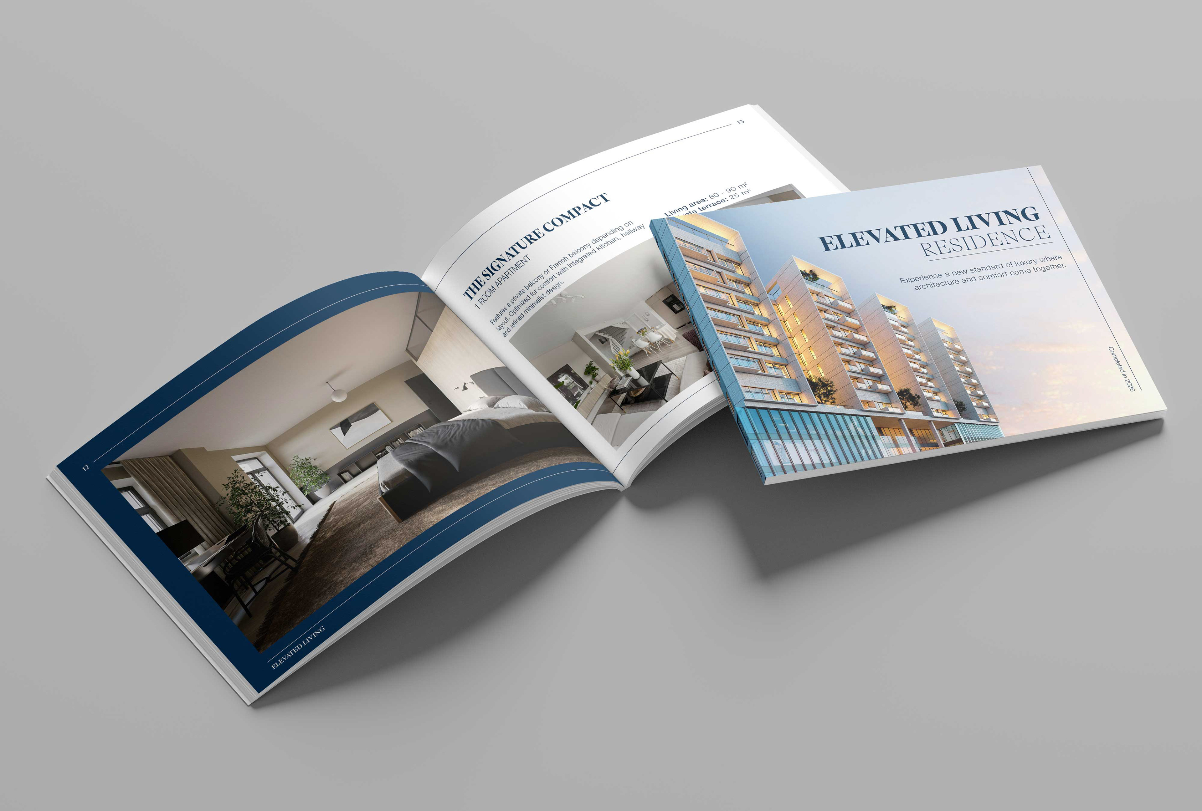
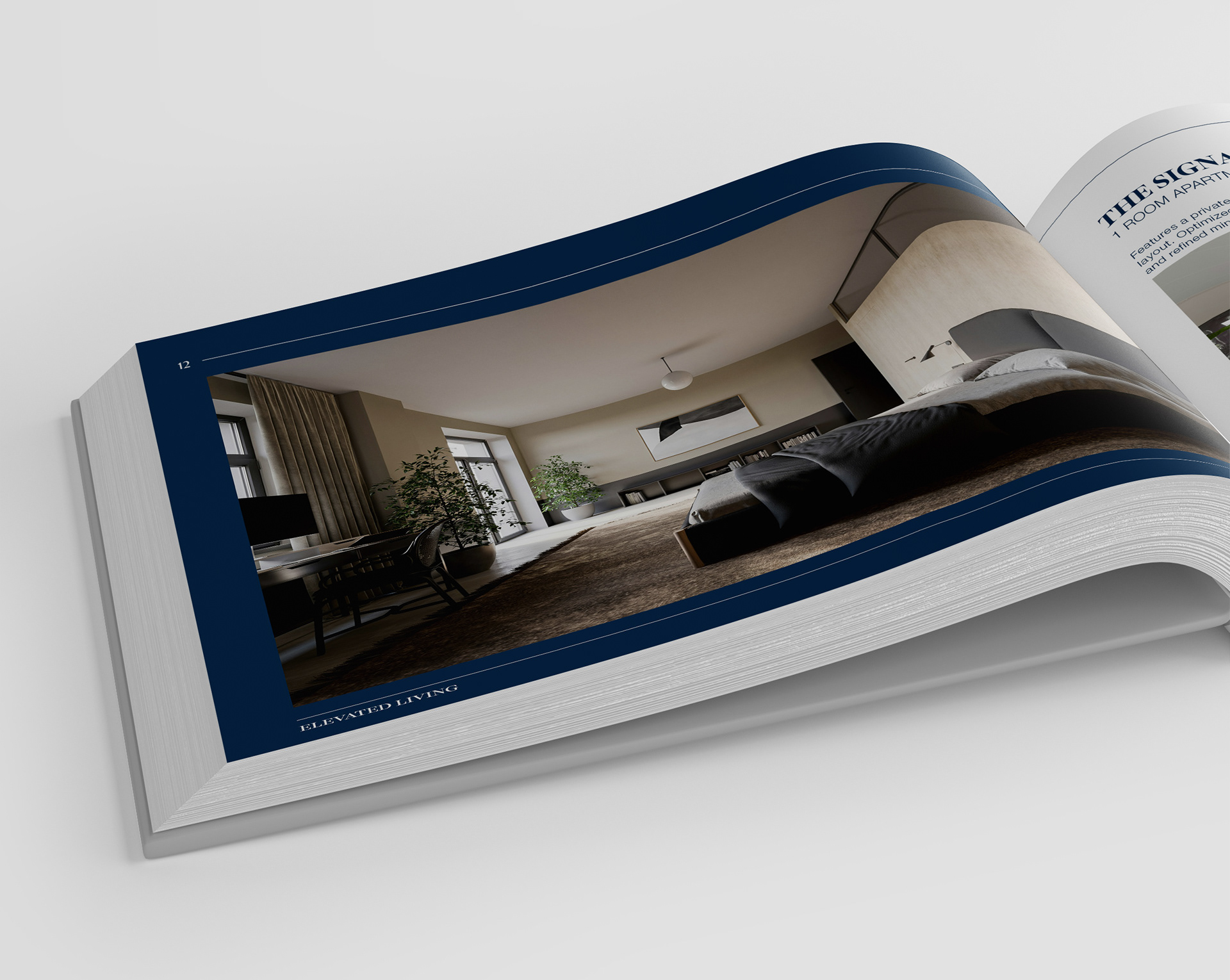
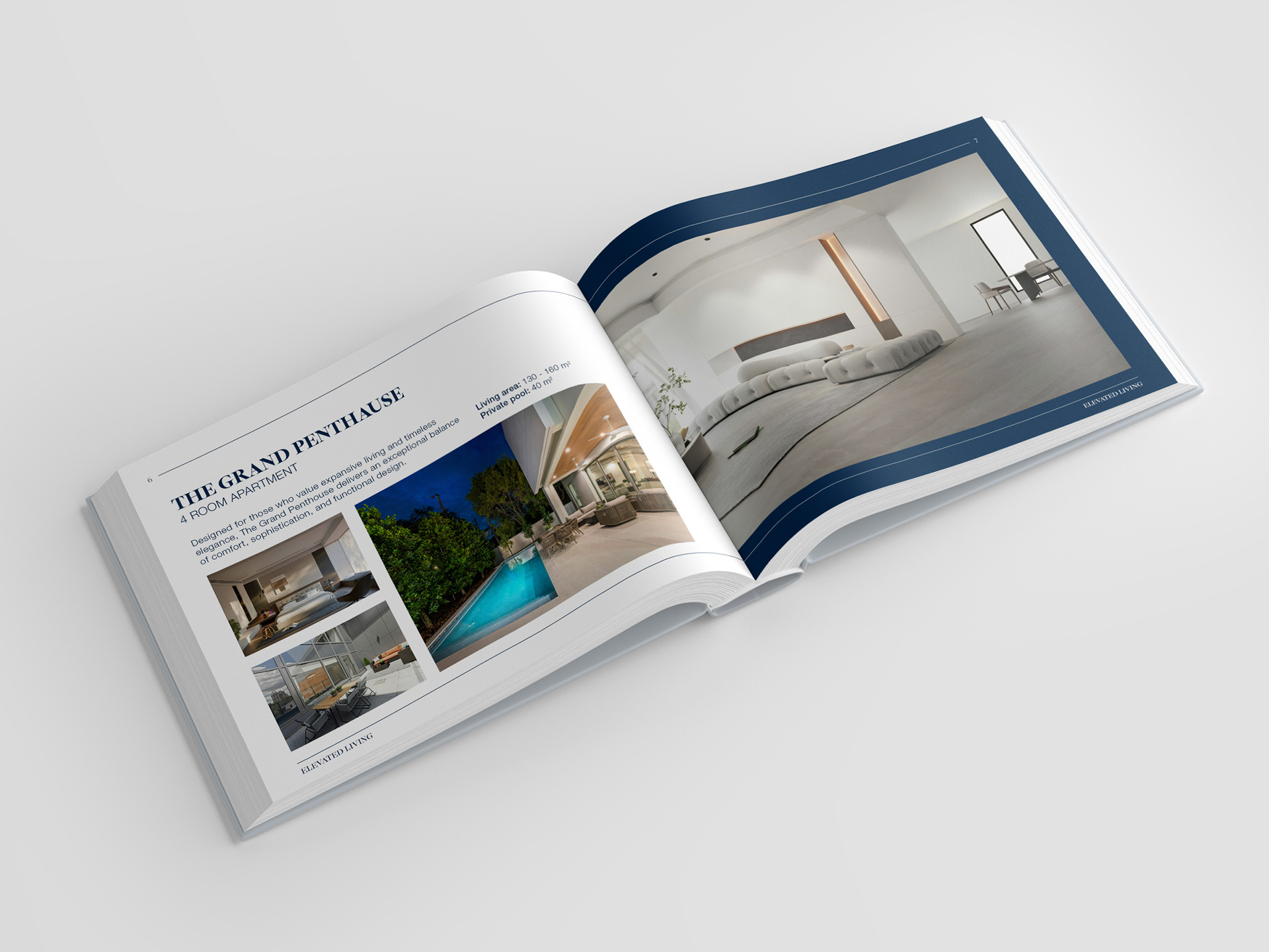
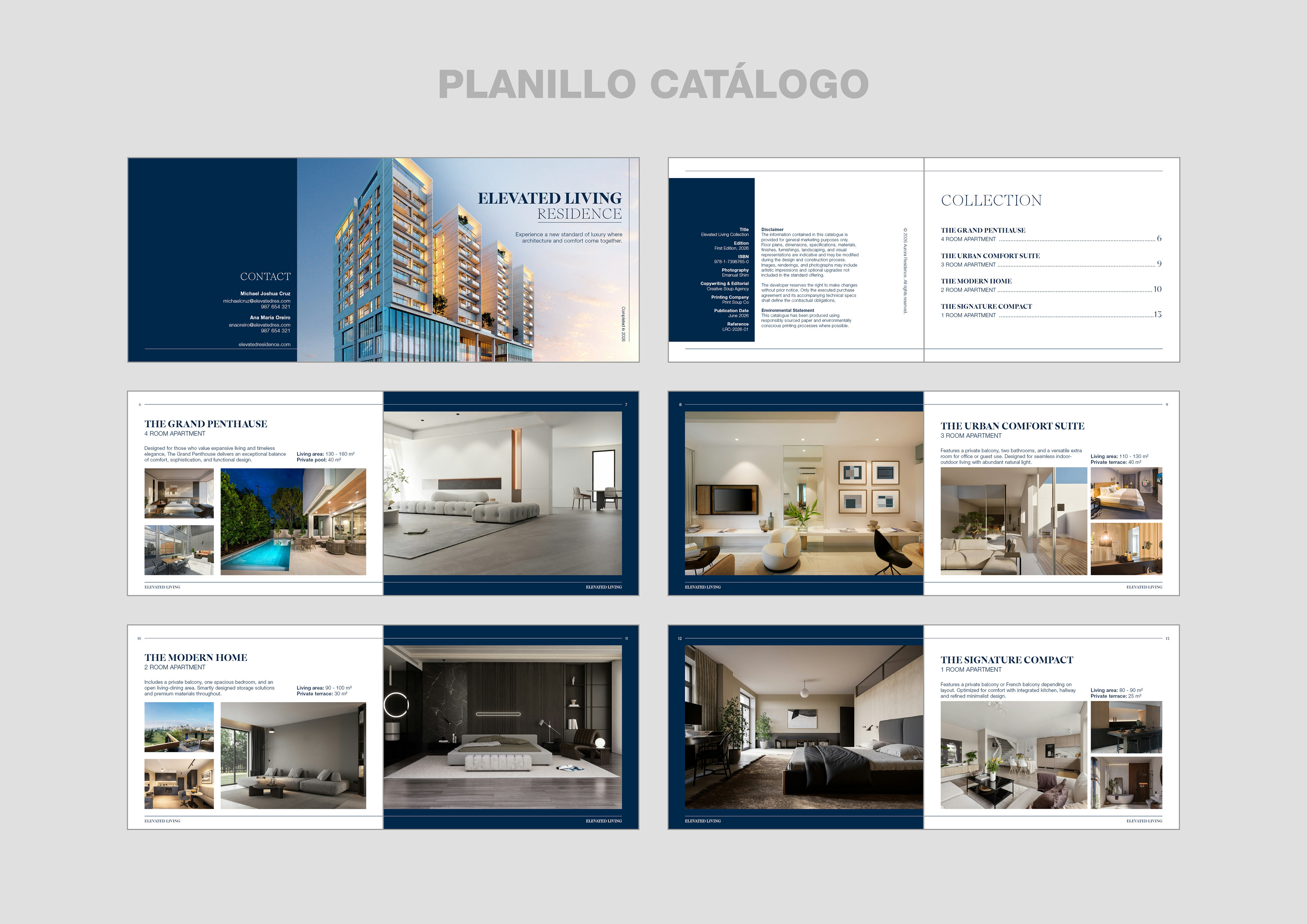
Catalogue Real Estate
This project was the subject of the first exam for the Typography and Layout course. The main requirements were that the number of pages had to be divisible by four and that the document complied with technical printing standards, including the use of bleeds, appropriate color profiles, crop marks, page numbering and automatically generated headers.
The aim of the exercise was to apply the knowledge acquired throughout the module, combining editorial design principles with the technical requirements involved in preparing a professional, print-ready file.
Catalogue Spreads Design
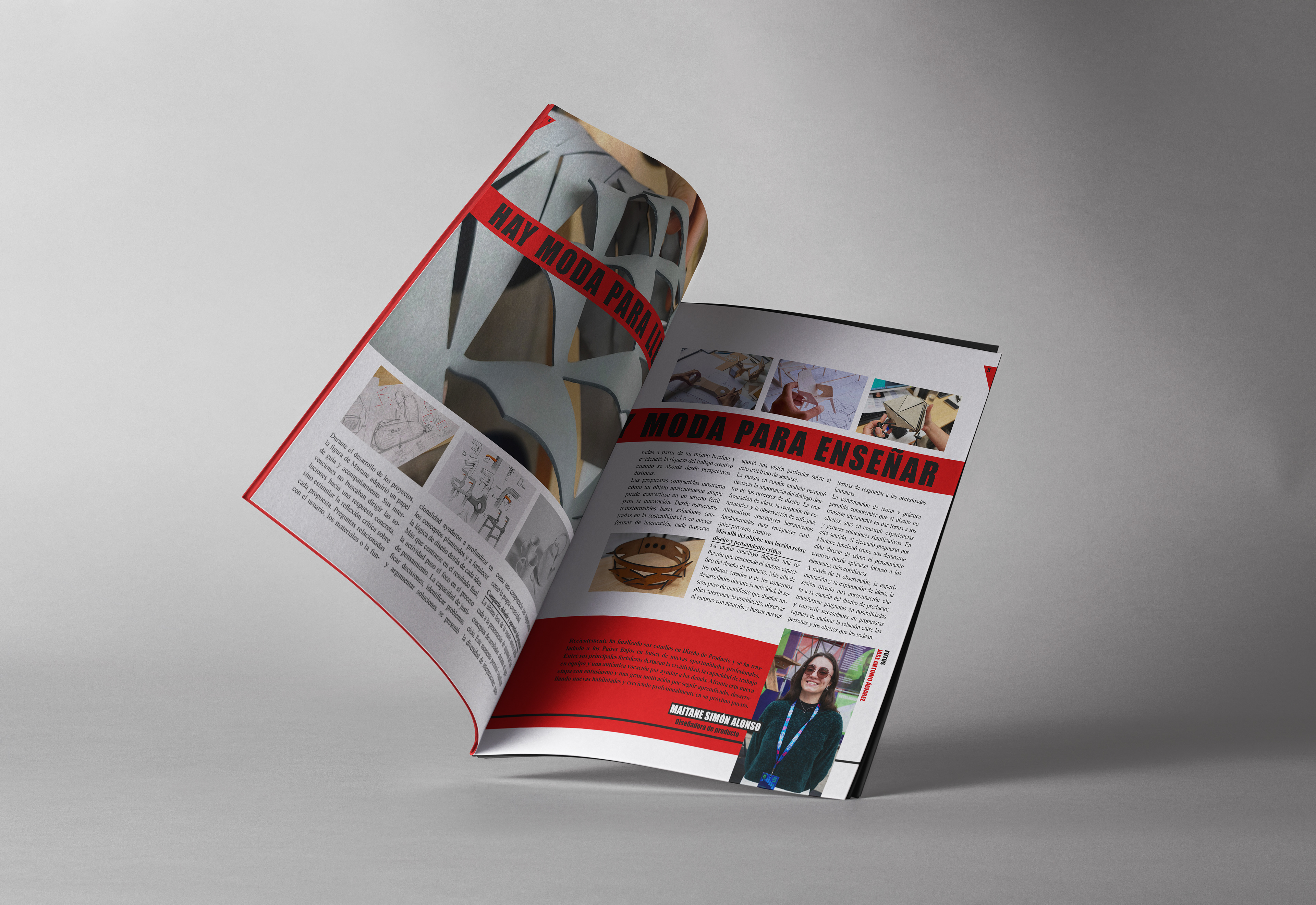
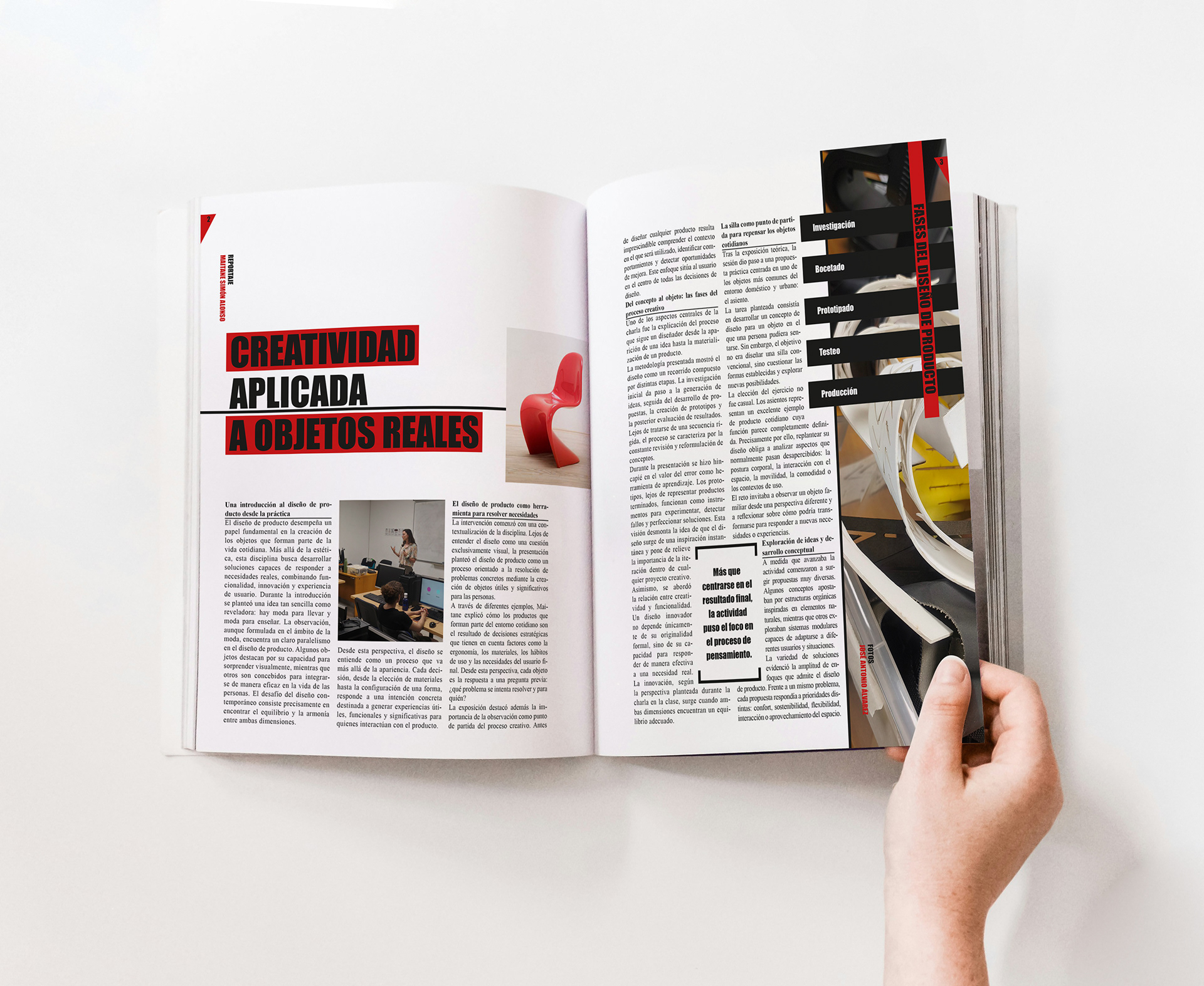
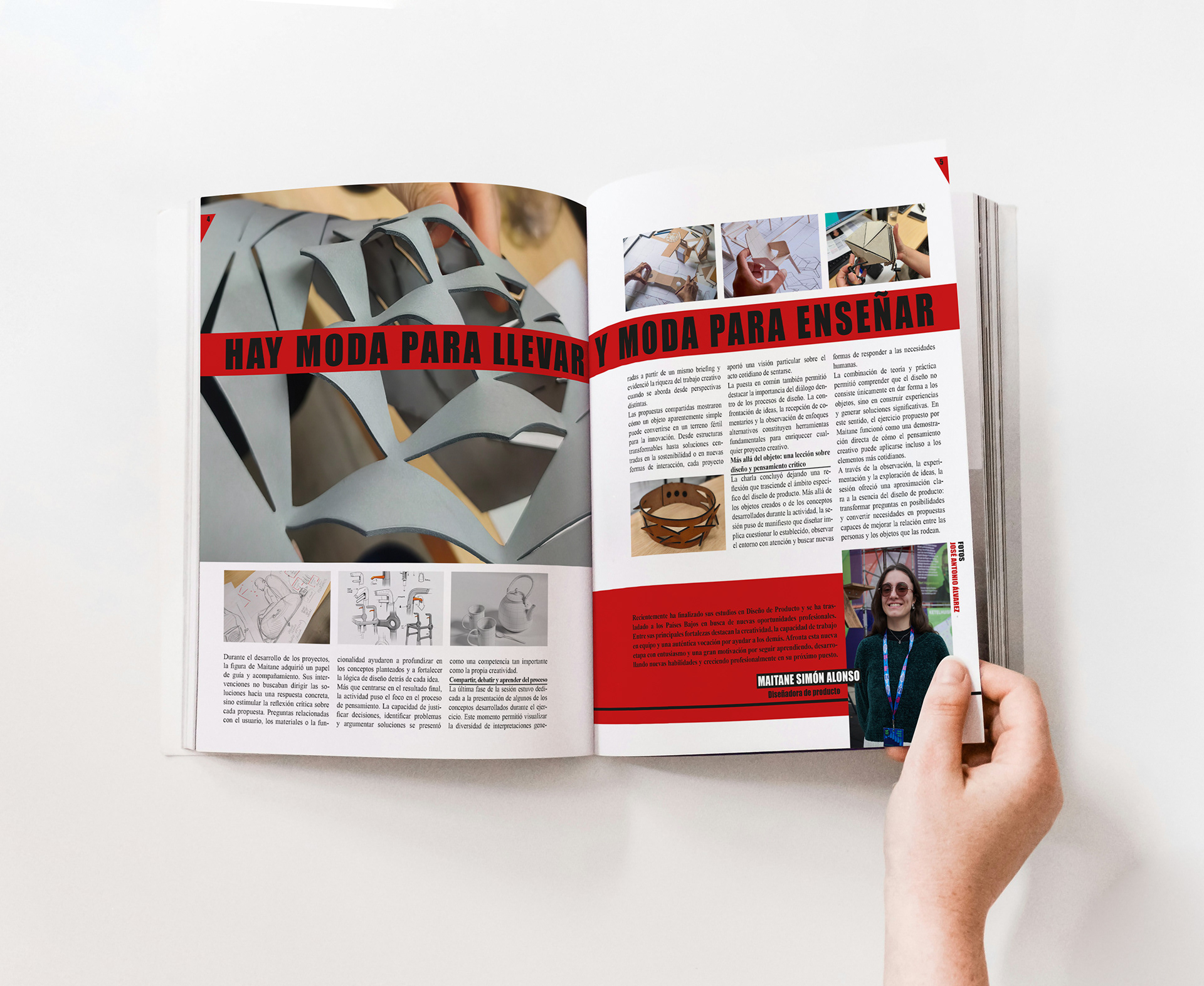
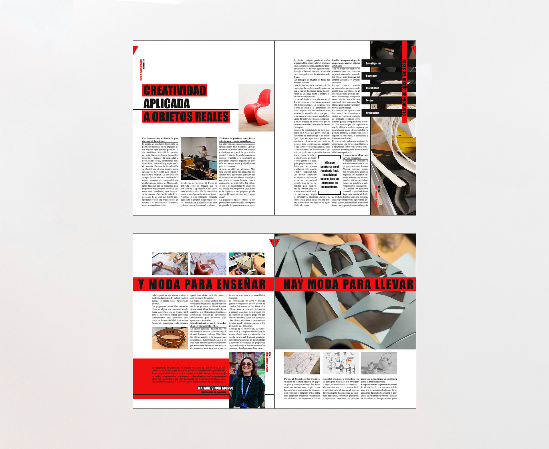
For this project, we were tasked with designing two spreads for a catalogue based on a presentation given by a classmate. We were responsible for both writing the content and developing the visual direction, while the photographs were provided by the professor.
The catalogue focused on the theme “Ligera,” which allowed us to explore different visual styles, grid systems, and editorial composition techniques. The exercise focused on understanding the importance of information hierarchy, selecting the most relevant content, and finding the most effective way to distribute it within the available space.
Magazine Spreads Design
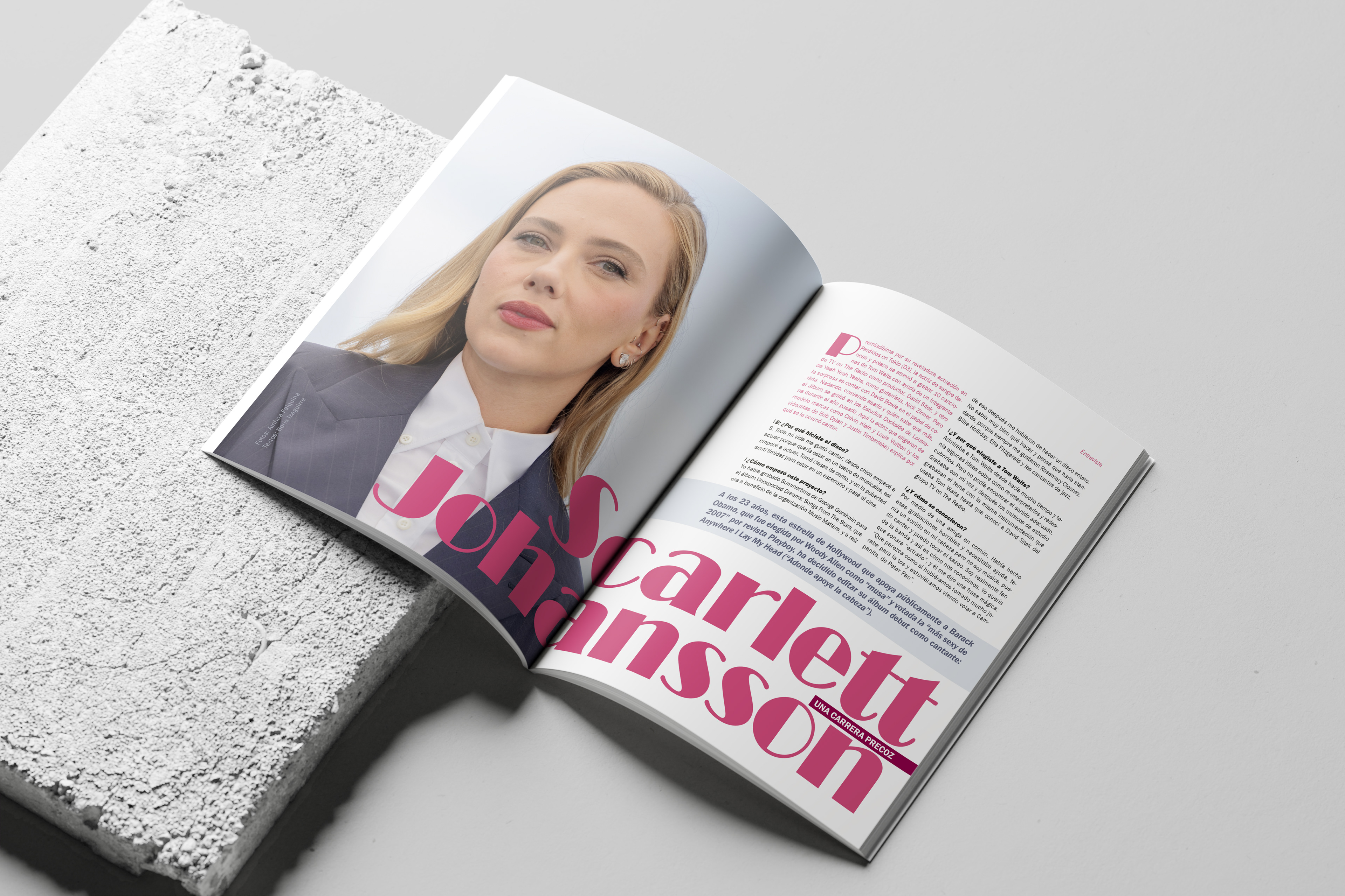
The objective of this project was to design a two-page magazine spread with a visual style inspired by Pop Art. The content consisted of a fictional interview with Scarlett Johansson, structured in an engaging, clear and well hierarchize layout to enhance readability.
As part of the exercise, the professor required the design to feature a large-format main photograph alongside a range of editorial elements, including an introductory paragraph, drop cap, pull quotes and an informational sidebar.
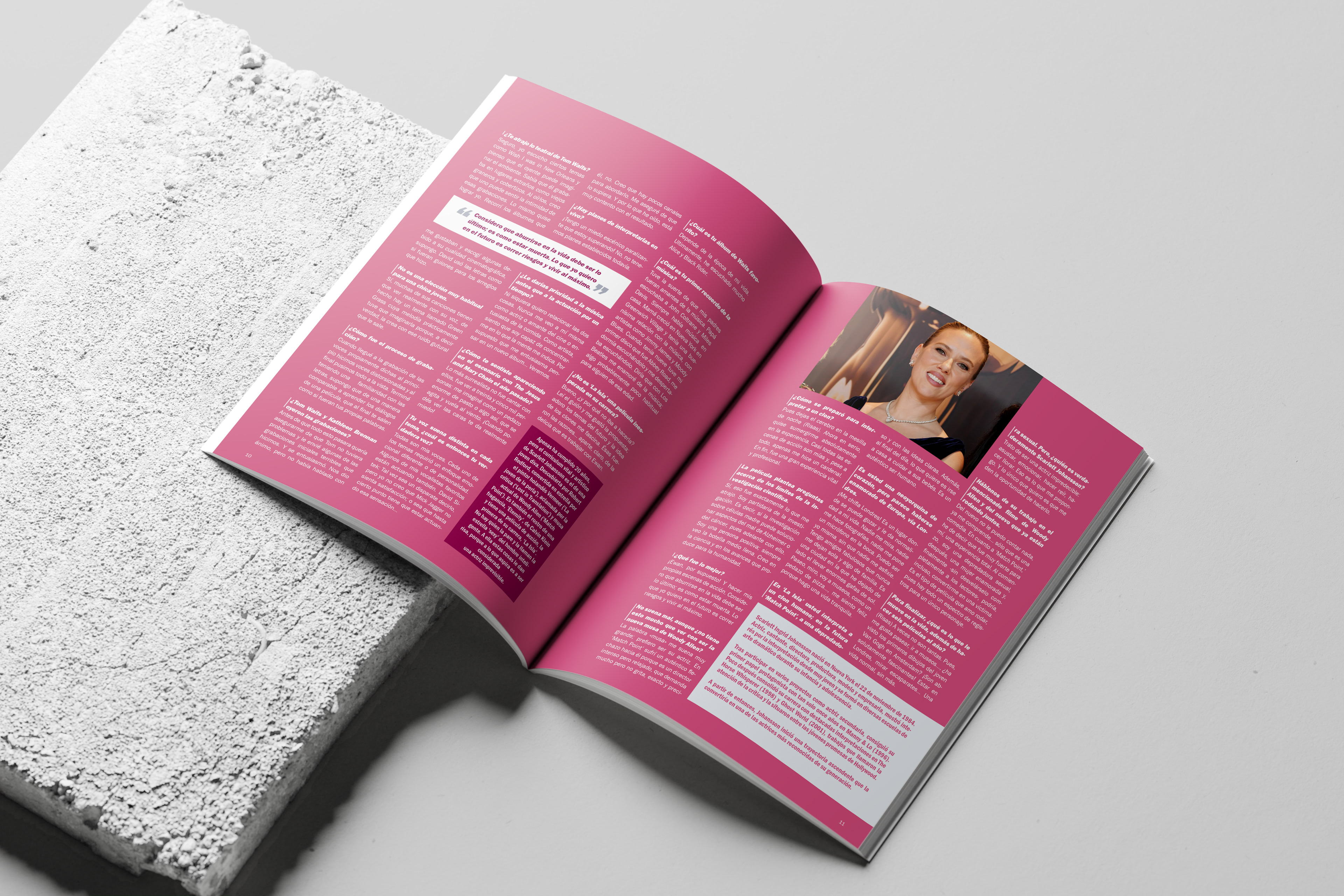
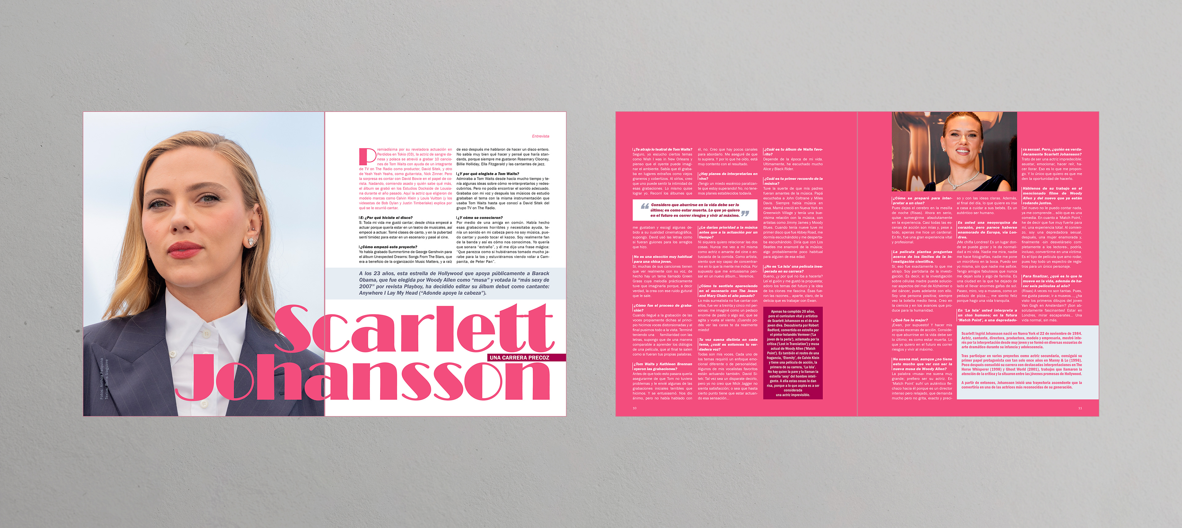
Magazine Spreads Design
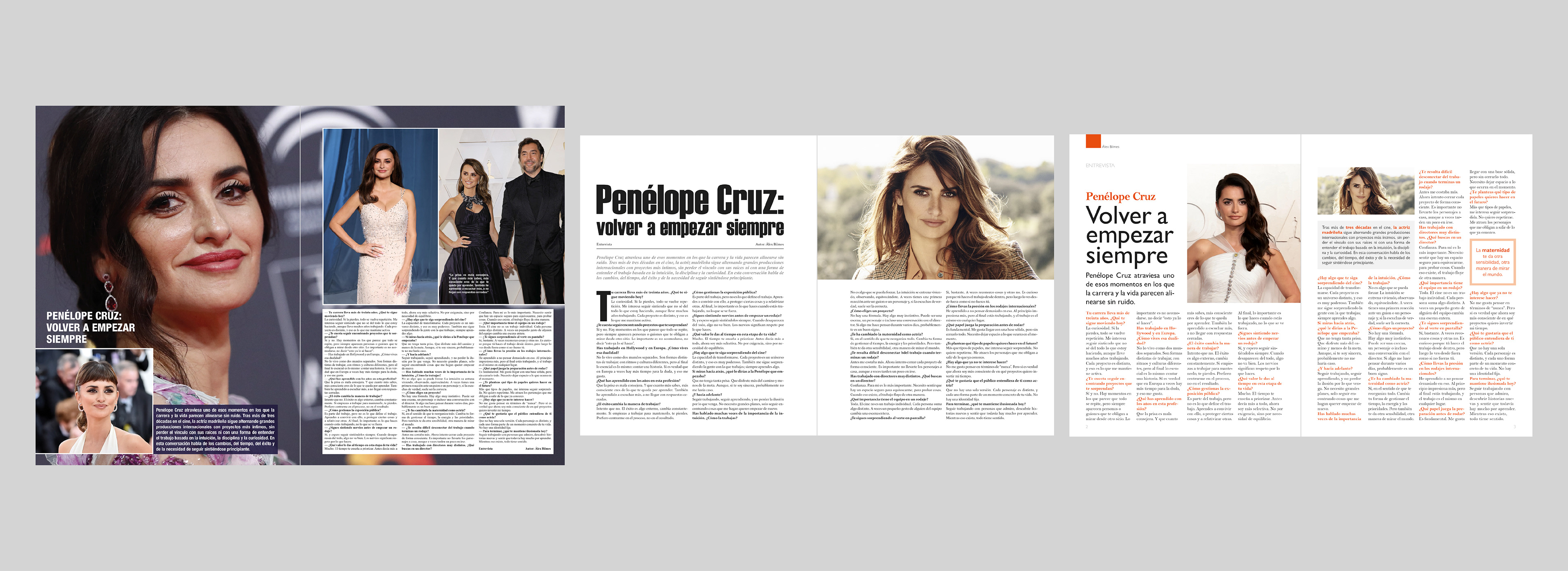
- Same content in 3 different styles -
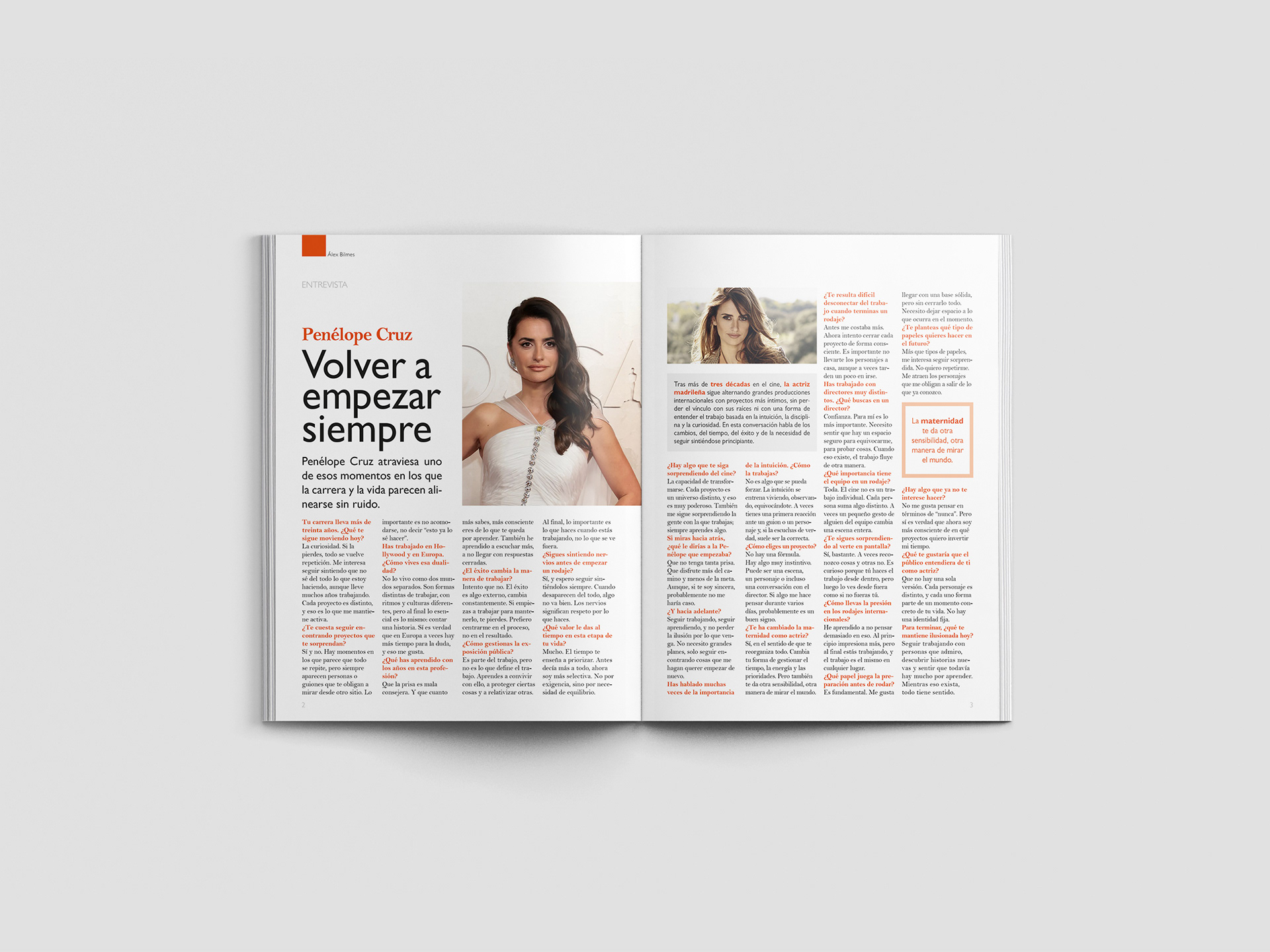
This project, titled "An Interview in Three Magazines", consisted of adapting the same editorial content to three different visual styles, using existing magazines from the Spanish market as references. The challenge was to preserve the visual identity of each publication while reinterpreting the same interview through different design and layout approaches.
Each proposal followed the grid system, typographic hierarchy, and compositional principles characteristic of its reference magazine, maintaining visual consistency while capturing the distinct editorial style of each publication.
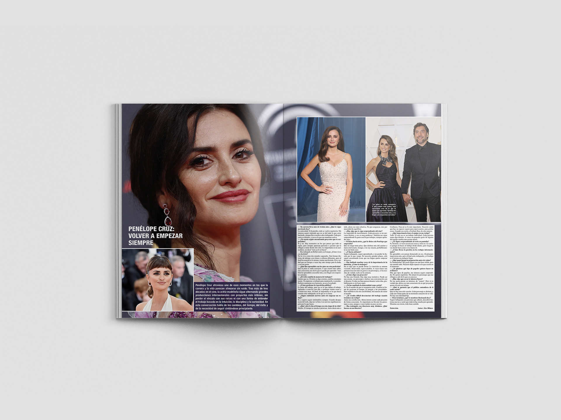
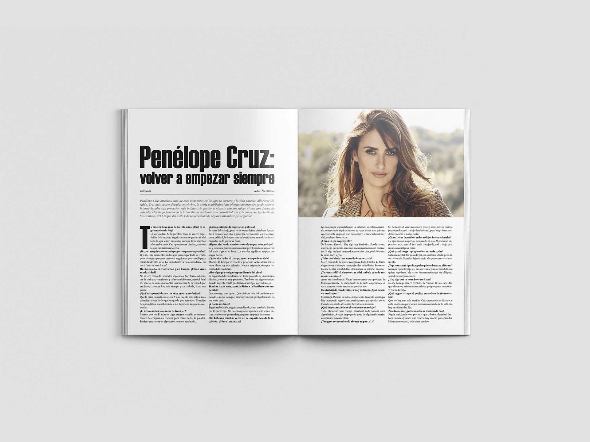
Book Cover
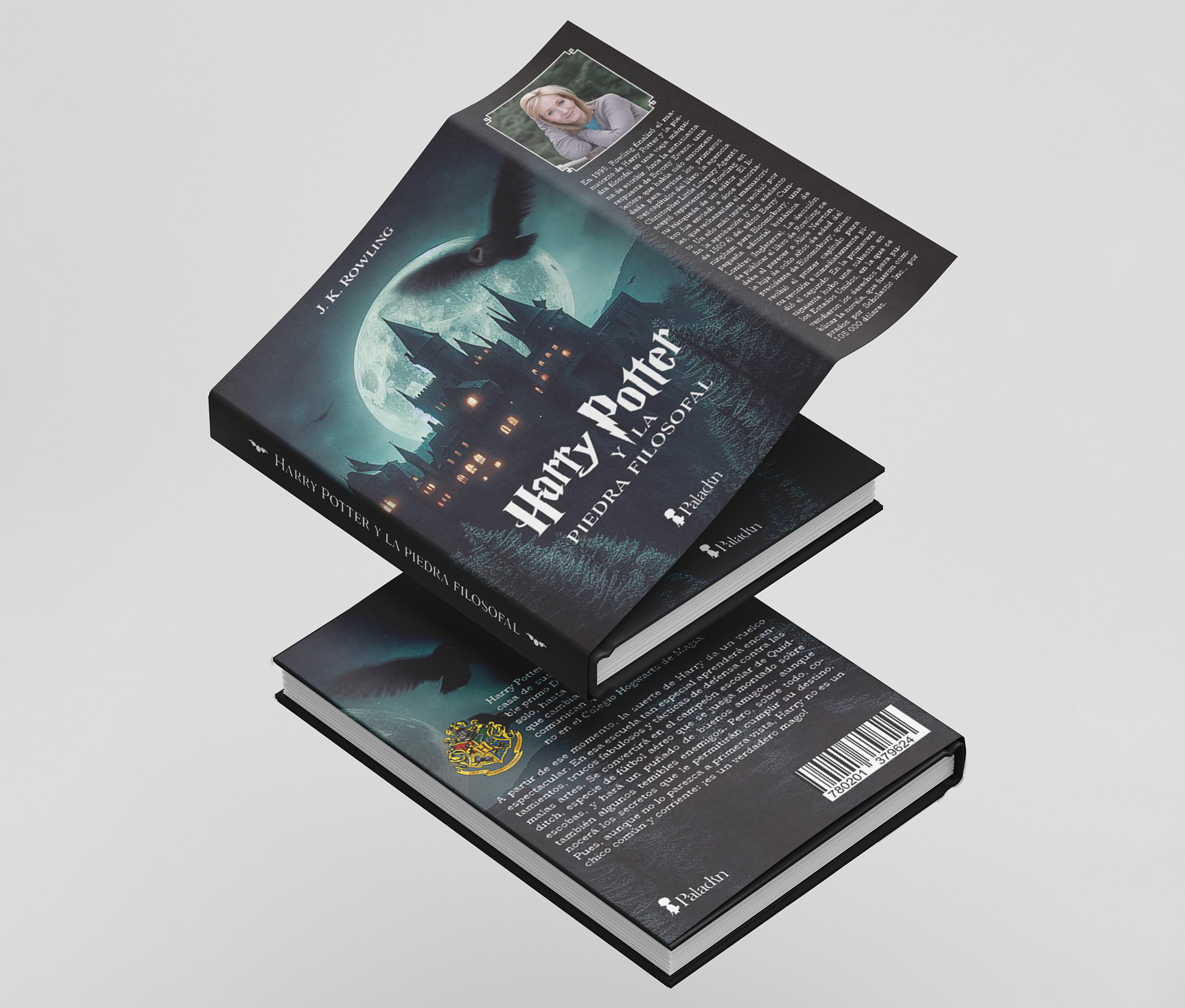
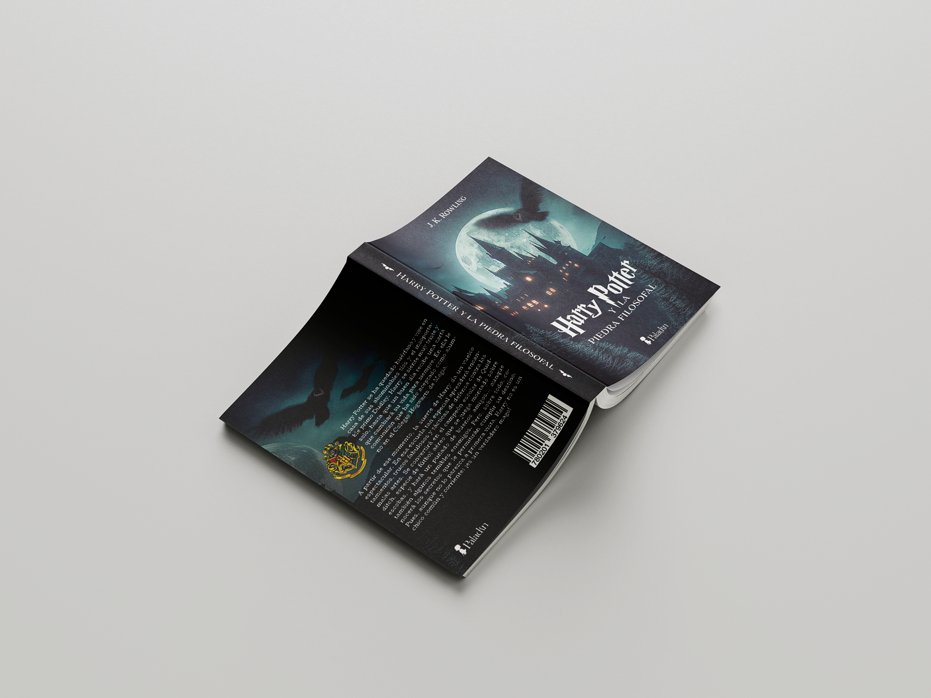
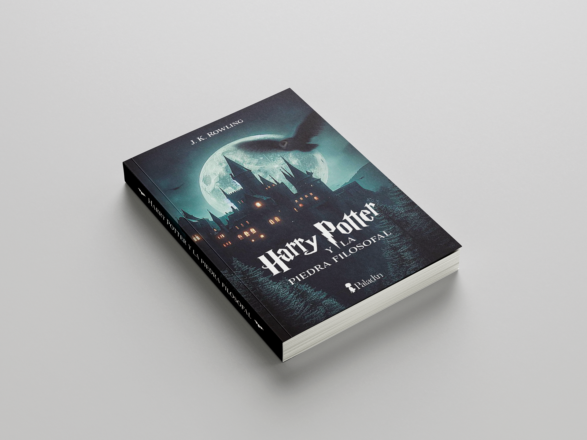
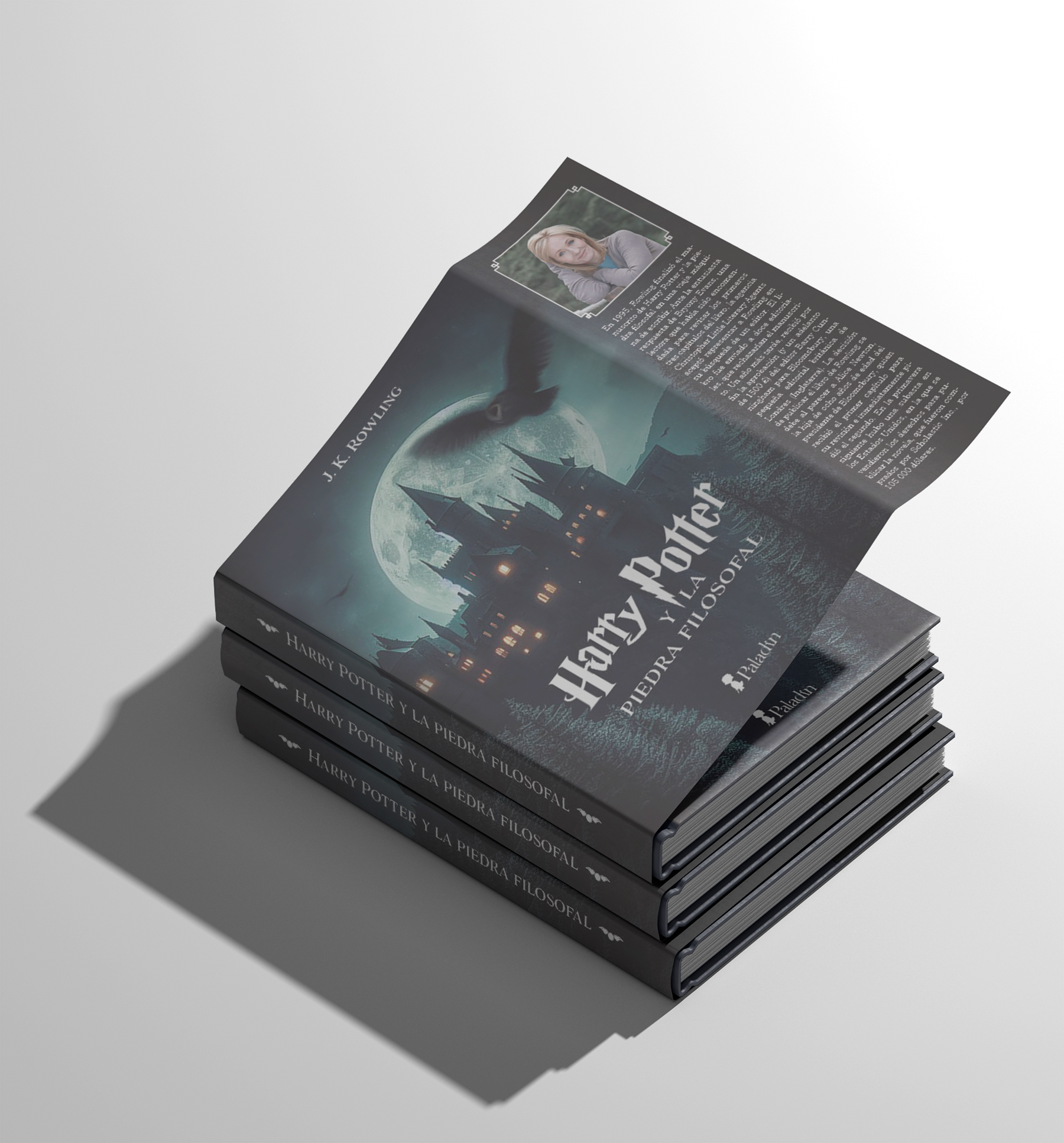
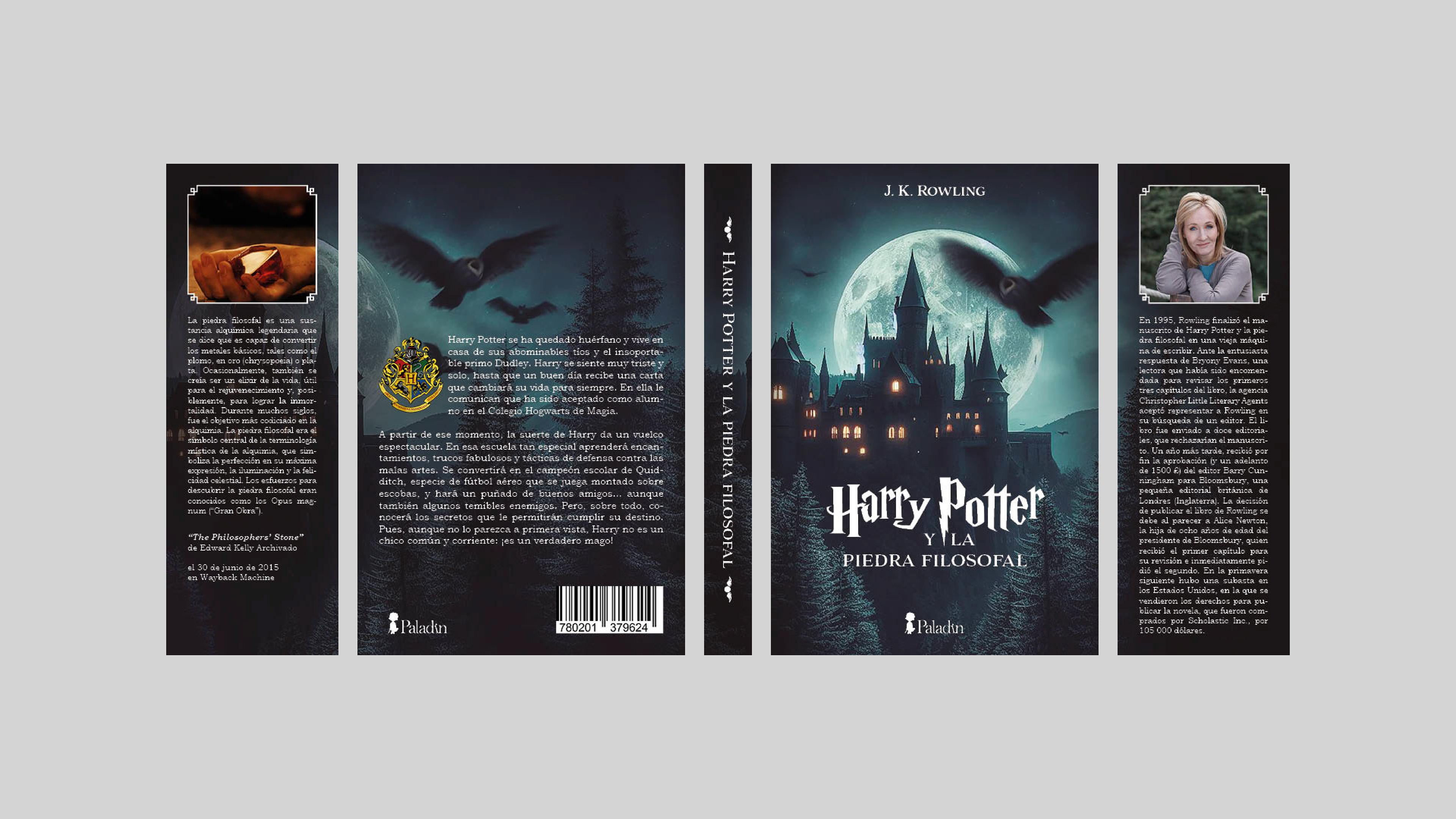
This project was particularly interesting because, in addition to developing the design, I had to present and justify each of my creative decisions. The exercise allowed me to understand that editorial design is not only driven by aesthetic considerations, but also by functional and communicative principles.
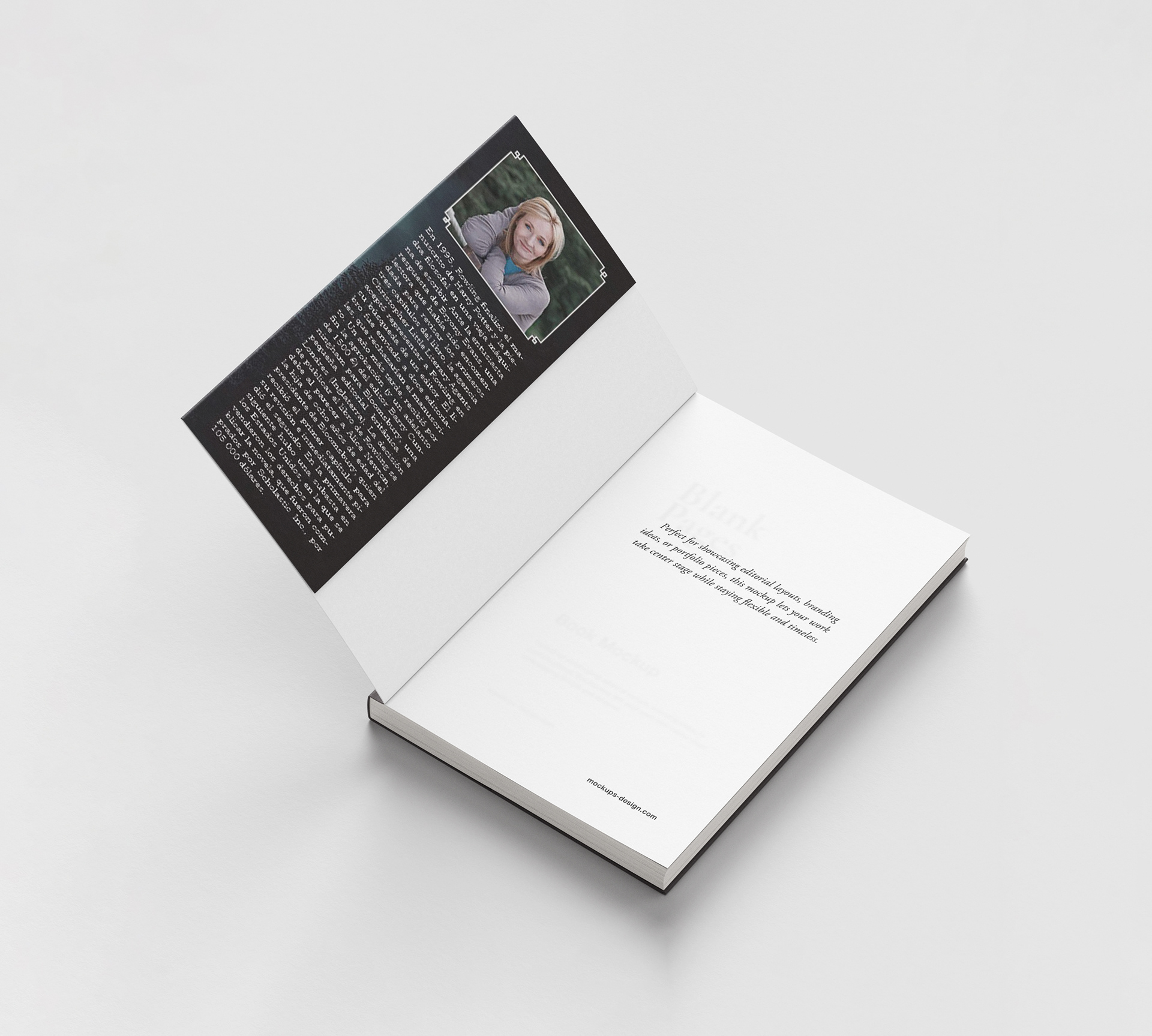
The project involved analyzing the complete structure of a book cover and understanding the different elements that make it up. I learned the purpose of each component, the front cover, spine, back cover and flaps, as well as the type of information each one should contain. For example, the spine typically includes the title and author’s name; the flaps can feature information about the author or the book; and the back cover includes elements such as the synopsis, barcode and publishing information.
Newspaper Cover
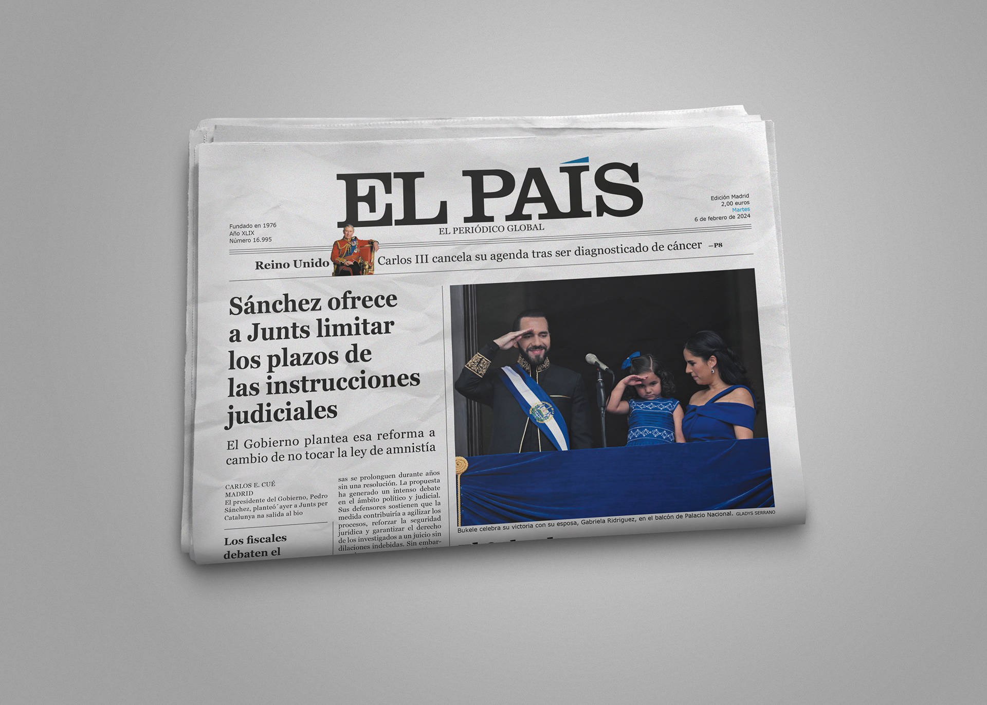
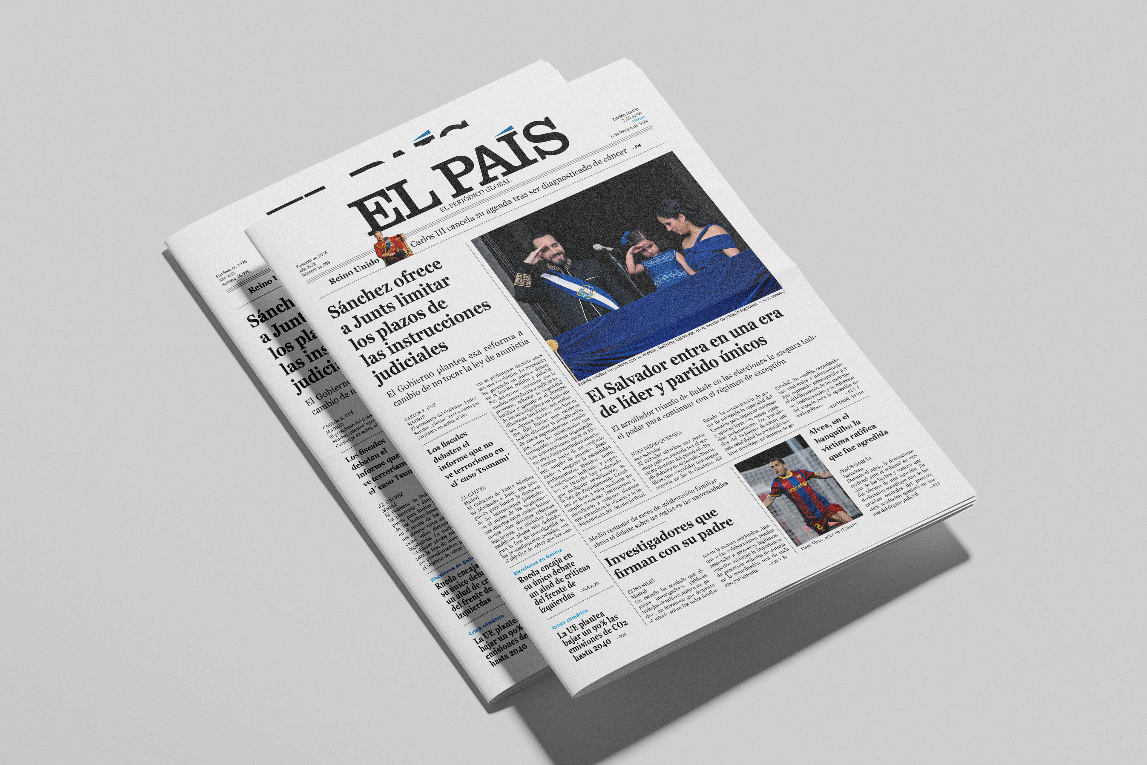
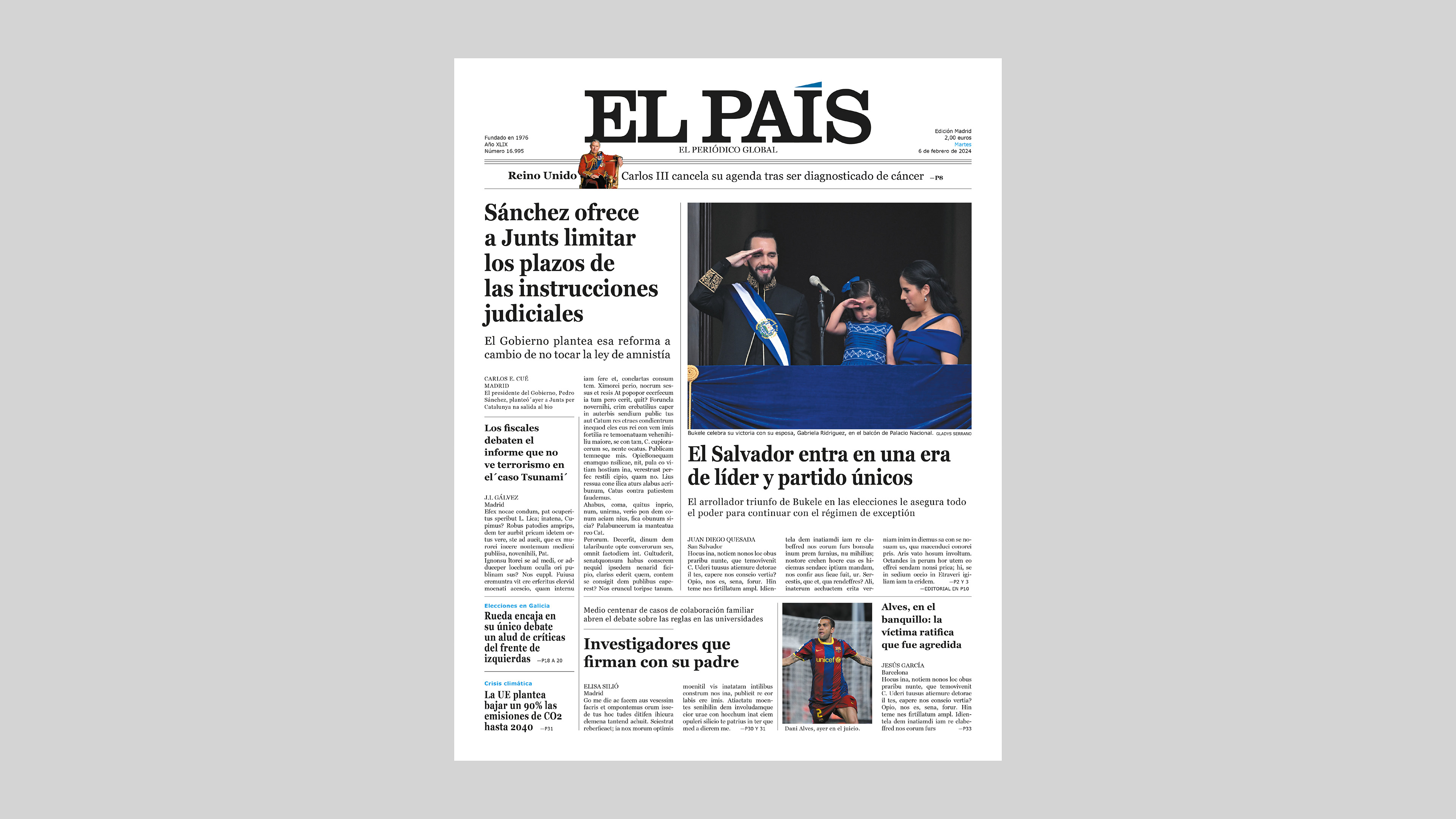
In this project, I learned how to analyze and measure newspaper typography, as well as how to divide a grid not only into columns but also into modules to organize information more effectively. For this exercise, we recreated the front page of El País, one of Spain’s most renowned newspapers, with the aim of understanding how content is structured, how an effective reading flow is established and how images and advertising spaces are integrated into the overall composition.
The layout was particularly challenging, as it was organized into three sections, each using a different grid system while maintaining a solid and coherent typographic structure. This project allowed me to better understand the importance of visual hierarchy, the balance between text and imagery and the application of editorial principles to enhance readability. It also strengthened my ability to work with more advanced grid systems and adapt them to different publication formats.
Newspaper Spread
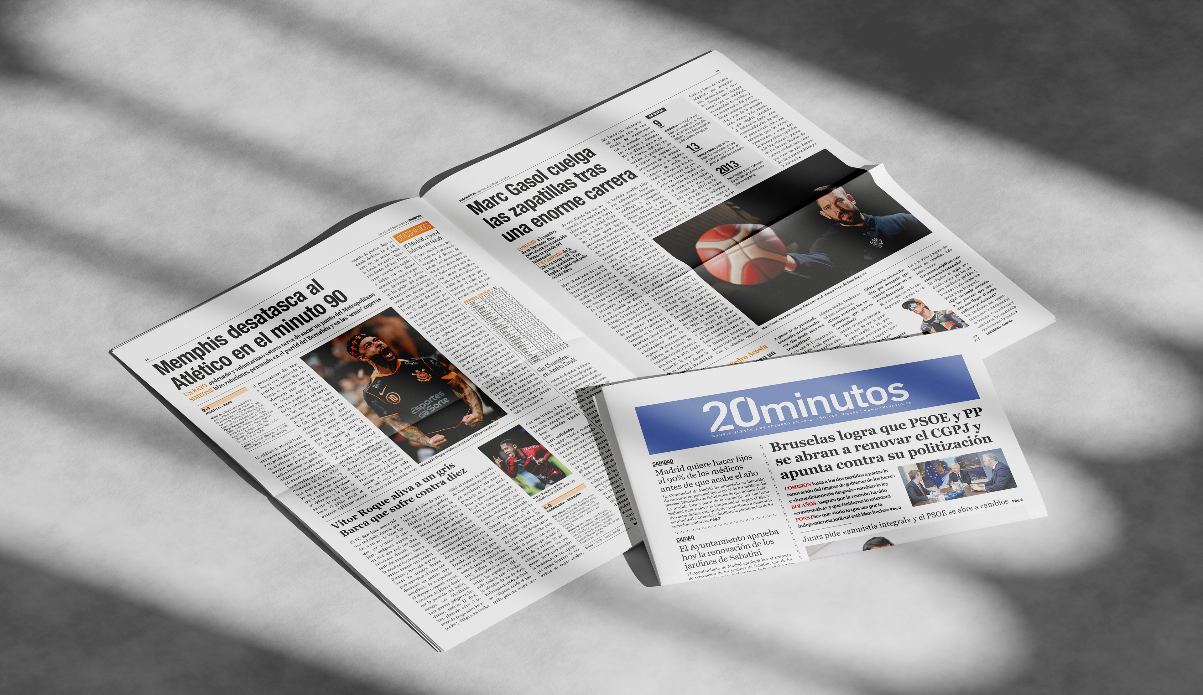
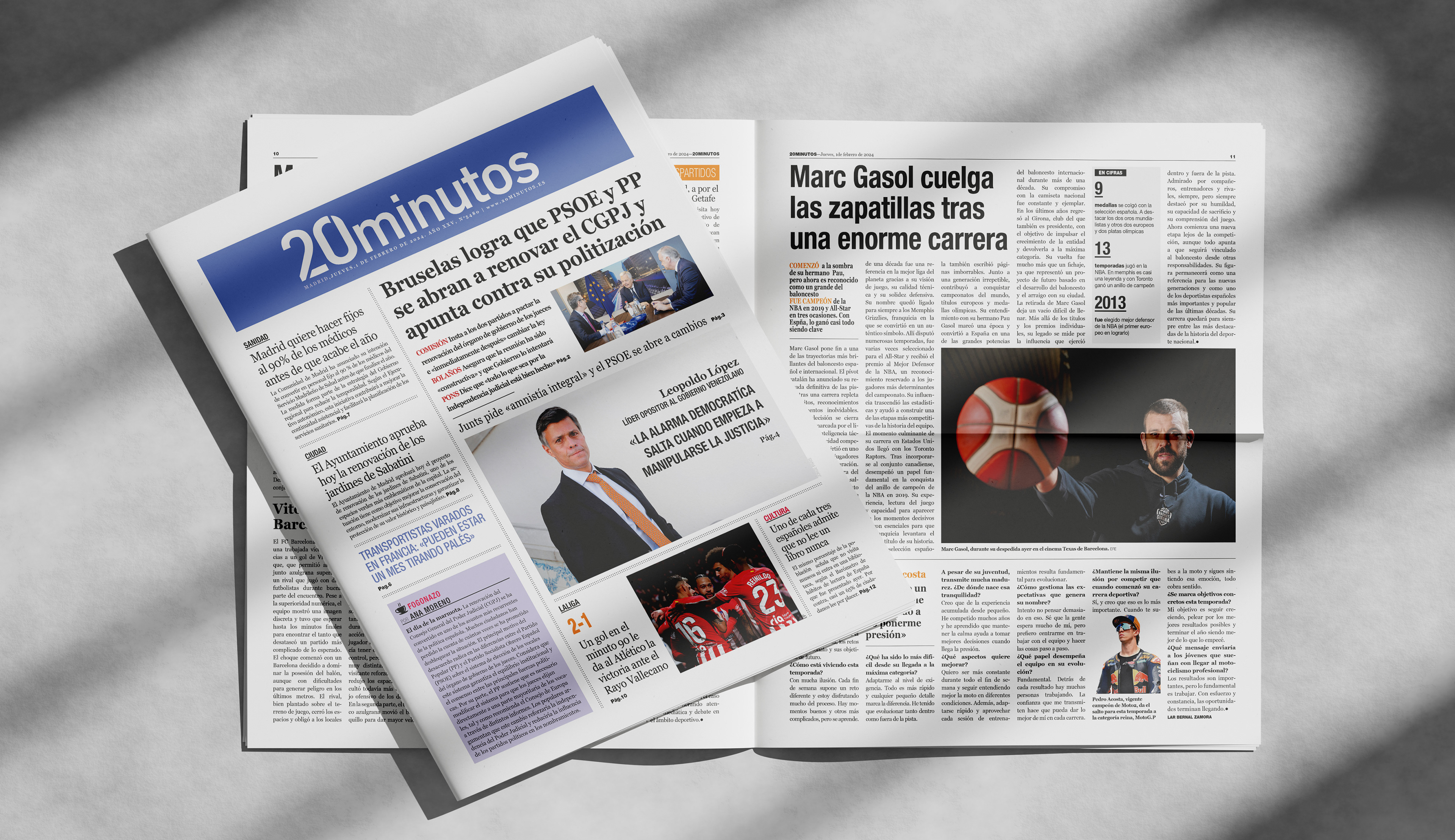
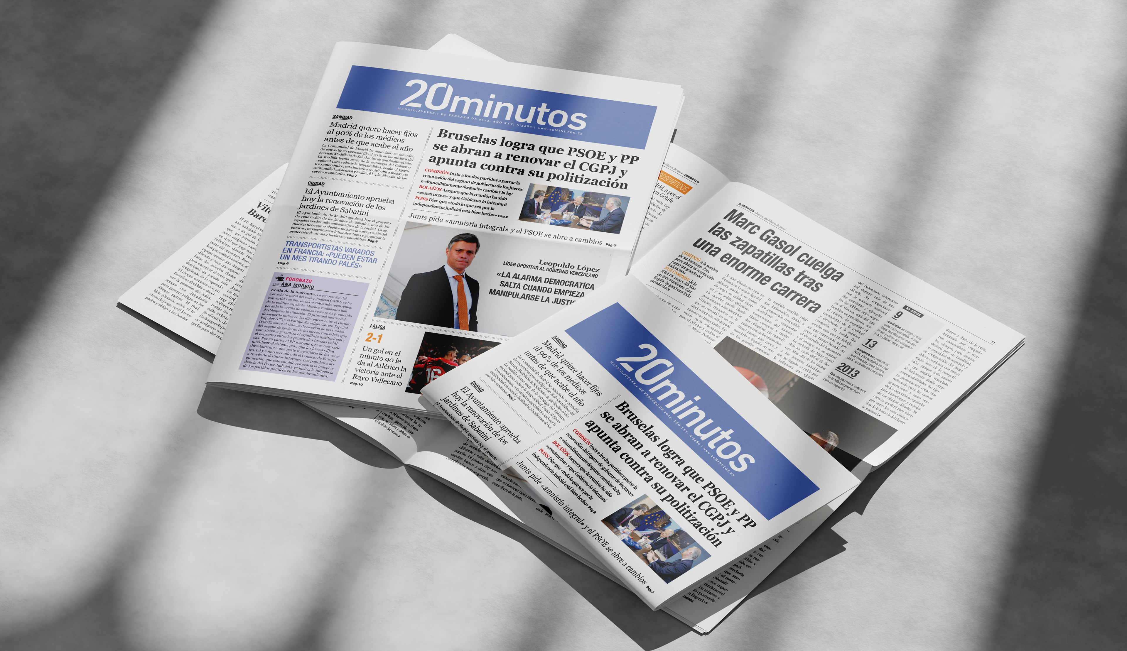
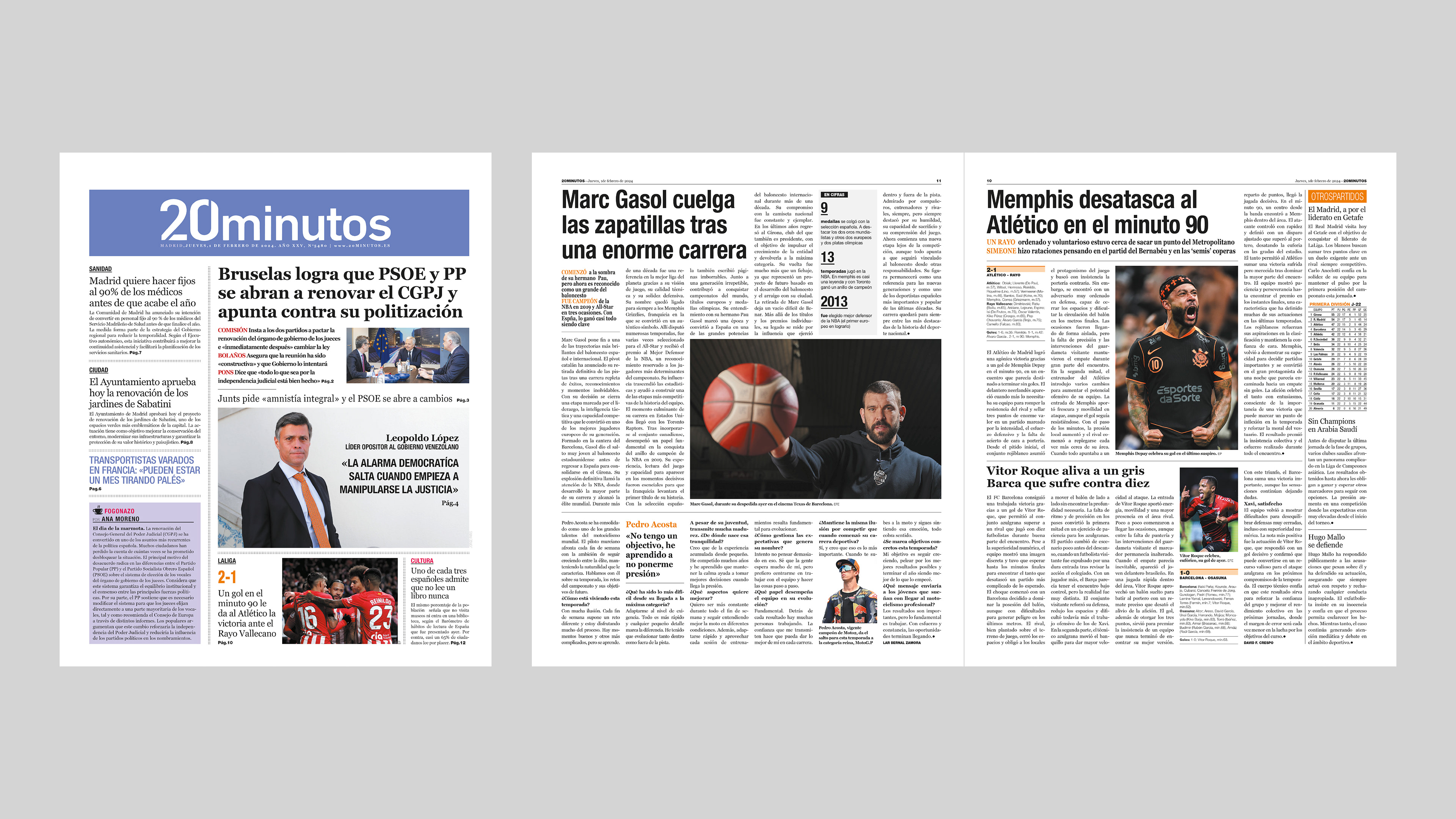
The same process was applied to an editorial spread for the newspaper 20 Minutos. The main challenge of this project was ensuring that the text aligned correctly with the baseline grid while maintaining a balanced distribution within the text boxes.
This exercise allowed me to further explore the importance of typographic precision and visual rhythm in newspaper design. I learned how to adjust font sizes, leading and spacing to achieve an organized, coherent and readable composition, while working within the practical constraints of an editorial layout designed for print.
Thank you!