I was commissioned to create two versions of packaging design for Nestlé, which had launched a new infant milk formula made from the best cow’s milk and fortified with essential minerals and vitamins to support healthy, age-appropriate growth. The packaging needed to clearly communicate these functional benefits while reassuring mothers that they were making the best choice for their child’s development. It also had to be simple, easy to understand, and adaptable across multiple markets and languages.
The client requested that the packaging and product name communicate two key approaches:
The first was a rational and descriptive approach that highlighted the main ingredient (milk), the functional benefits, and the product’s purpose of supporting healthy growth.
The second was an emotional and suggestive approach that connected with mothers through warmth, nurturing, and gentle playfulness, reflecting their care and love for their child.
I worked closely with the copywriter to ensure that the significance of the naming aligned with the design, so both elements reinforced each other and resonated with shoppers on both a practical and emotional level.
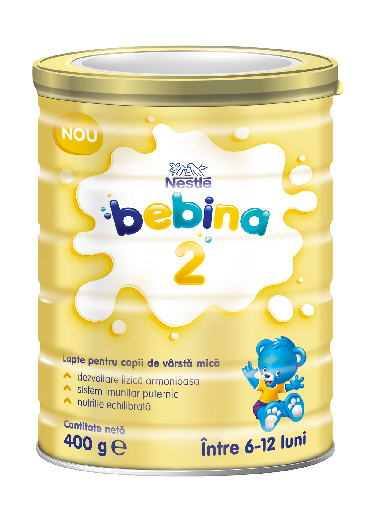
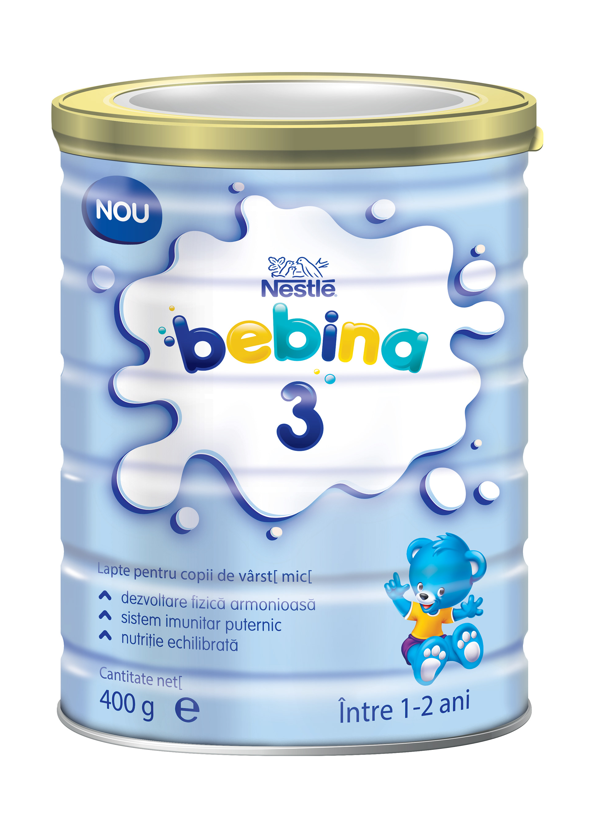
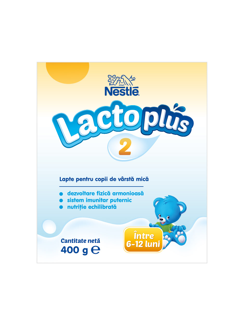
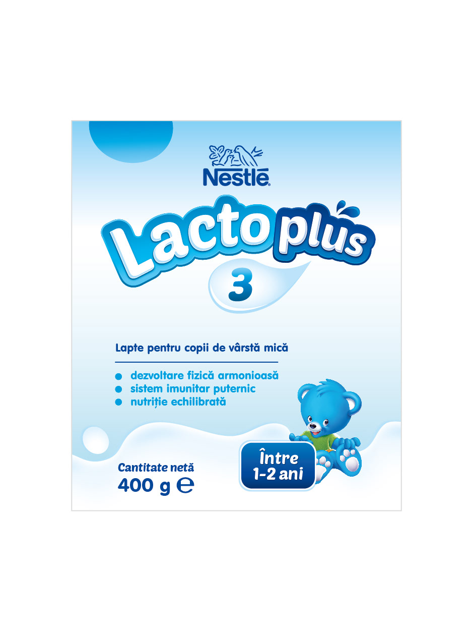
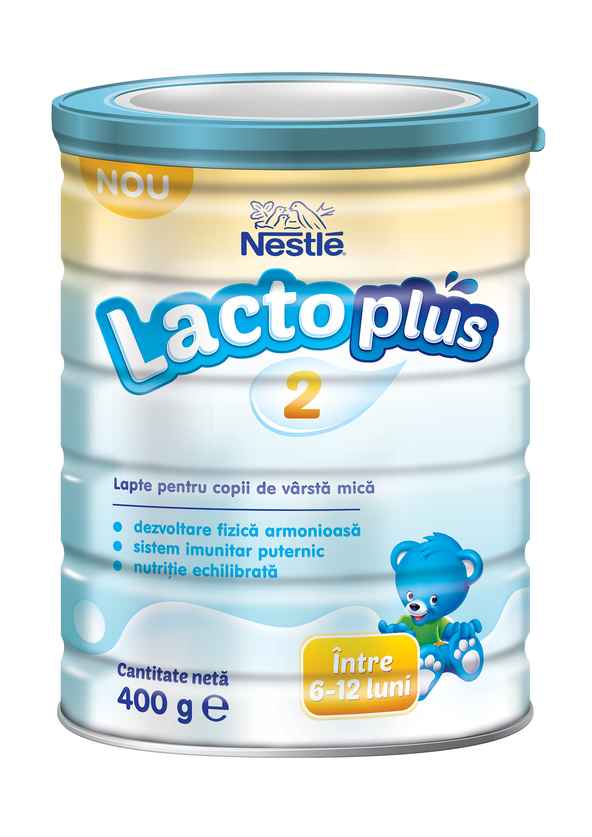
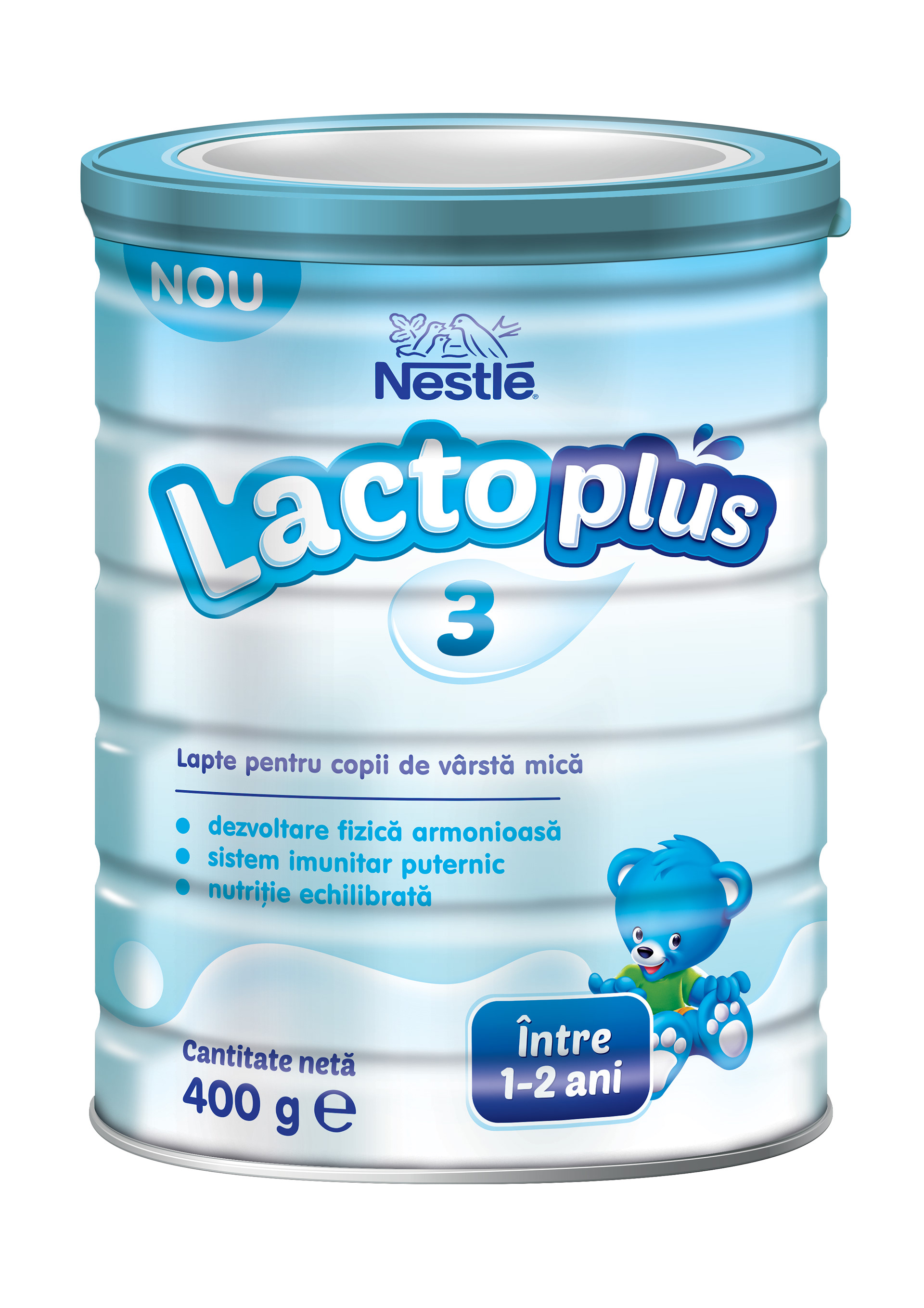
Concept 1
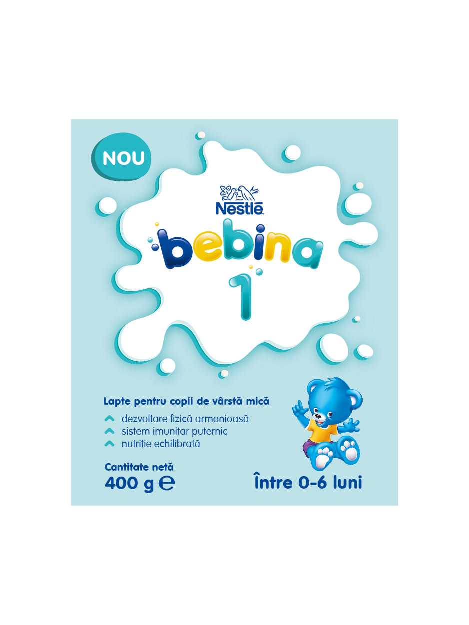
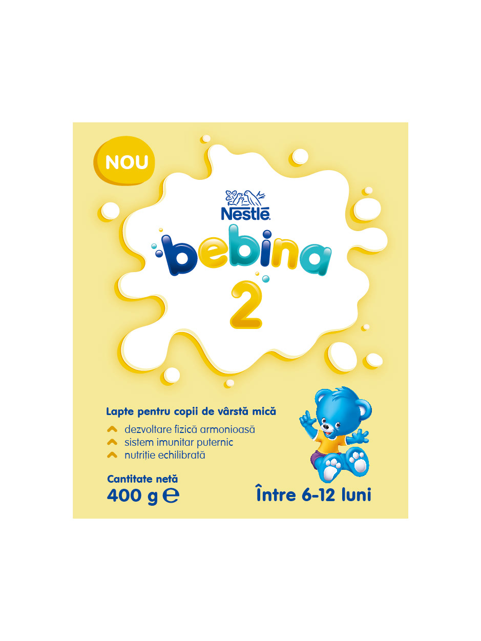
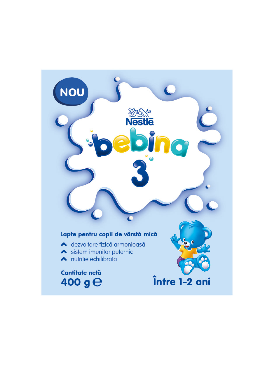
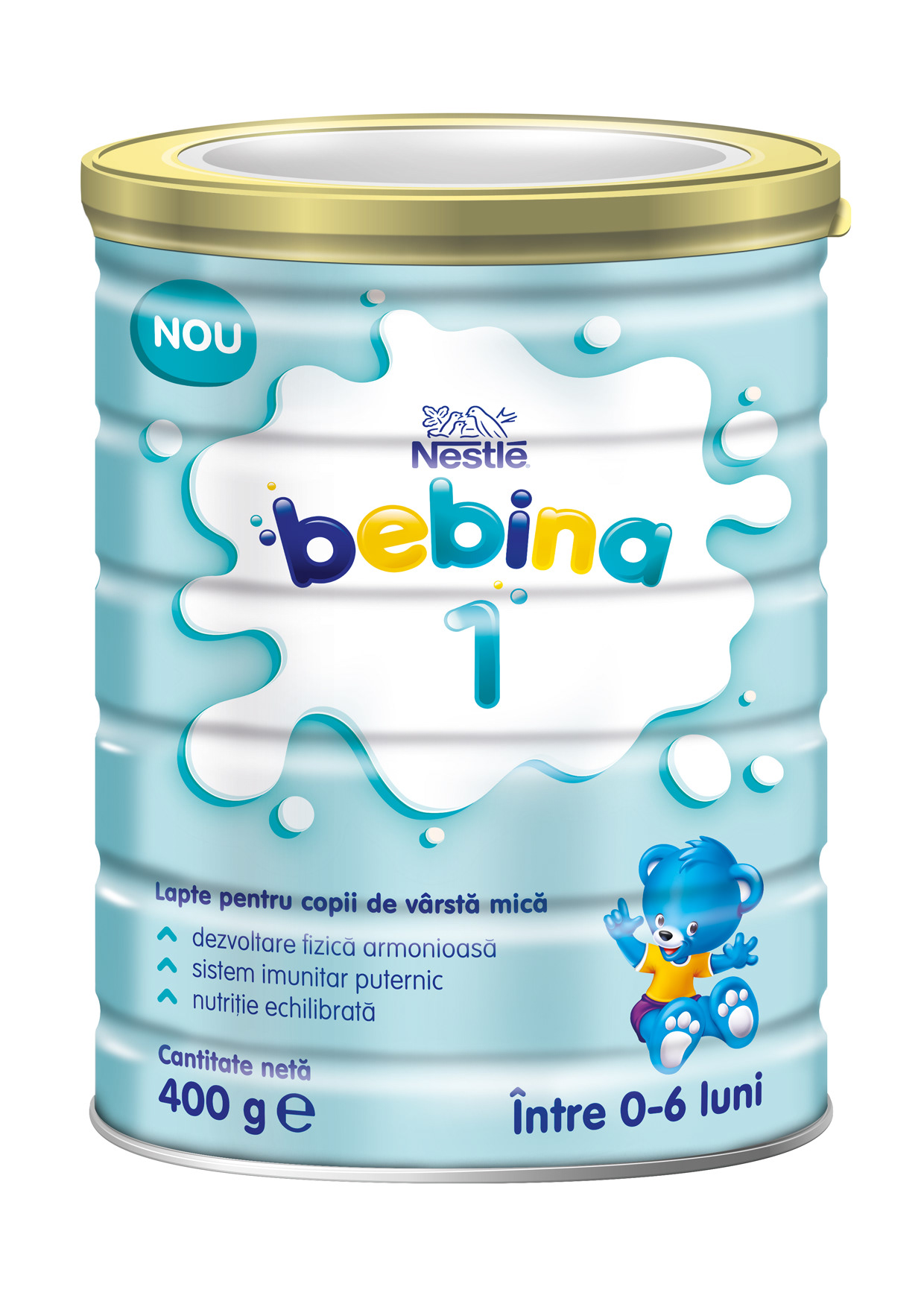
The use of a simple, clear font conveys trustworthiness and highlights Nestlé’s expertise behind the product. The stage number is integrated into a milk drop, with its color changing for each growth stage to make it easy for parents to identify the right formula. A clean, straightforward color scheme reinforces a sense of reliability and professionalism, while the main ingredient, milk, is visually emphasized both in the logo and at the lower part of the packaging, clearly communicating the product’s key benefit.
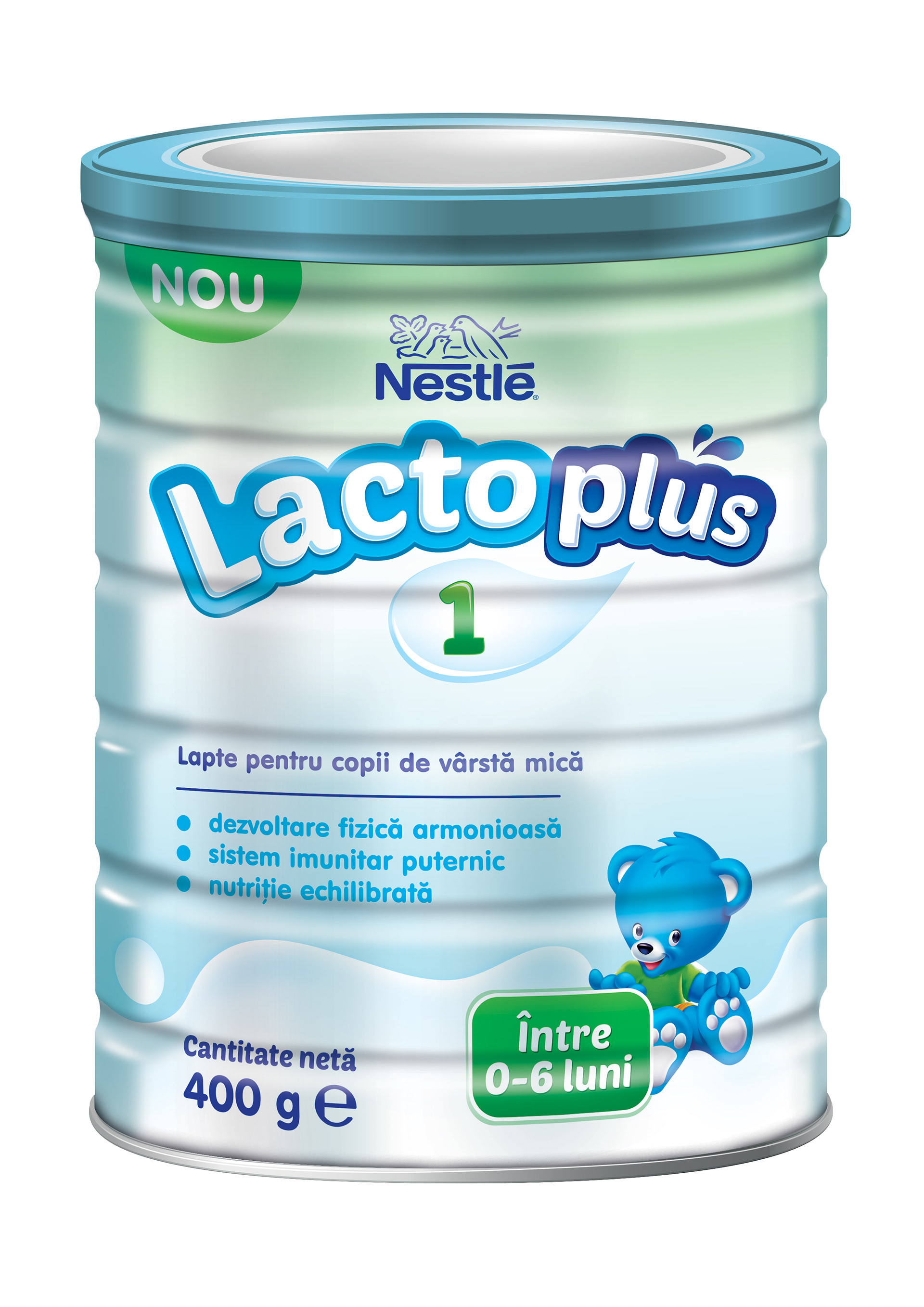
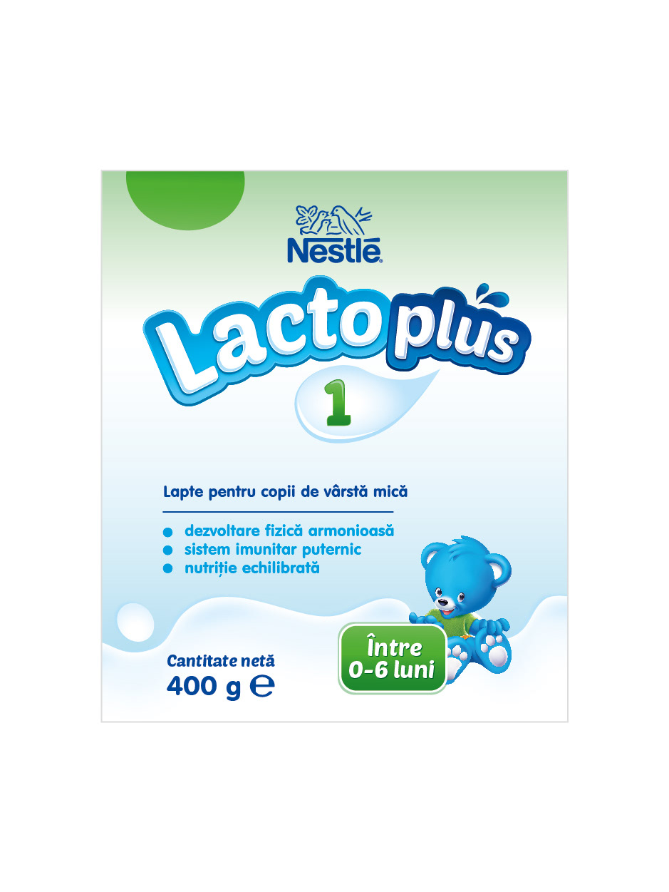

Concept 2
The product name is simple and clear, directly stating its purpose for babies, while using a diminutive to evoke love and endearment. It can also suggest a playful connection, like “Beba’s little sister,” to strengthen emotional appeal. A handwritten-style logo adds a touch of warmth and playfulness, drawing attention on the shelf. The stage number changes color to match the package’s color scheme, making it easy to identify the correct growth stage while maintaining a friendly, nurturing feel.